Monday, 20 May, 2024
SEO Quick Tip: How to Resolve Mobile Usability Issues in Google Search Console
Adventures resolving mobile friendly bugs reported by Google Search Console.
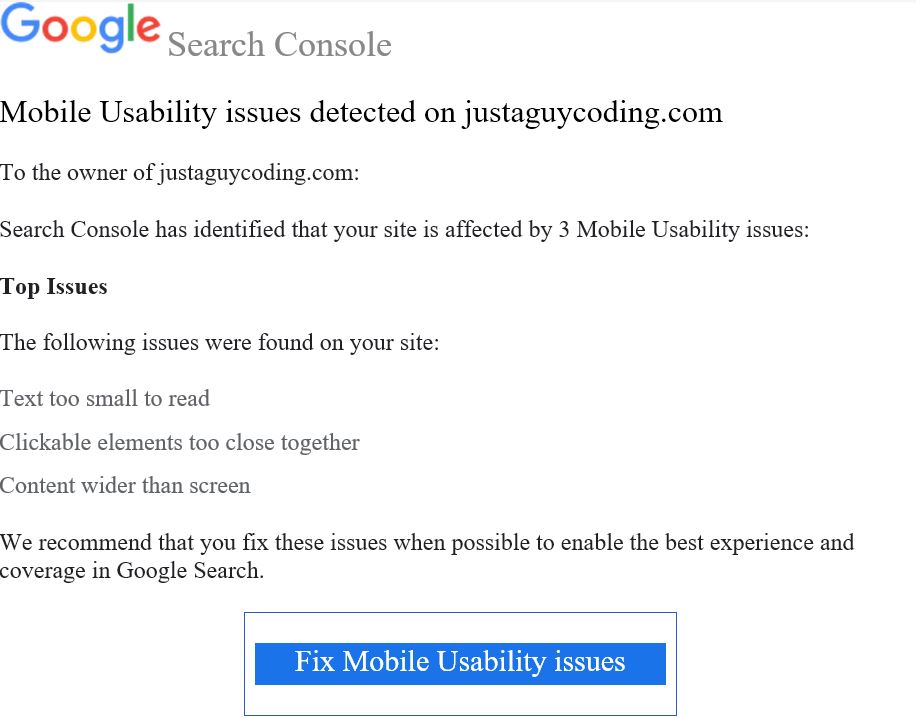
Late last night I received an email from the Search Console Team letting me know my website had some “Mobile Usability” issues.
Now, it may not seem like it, but this is a good thing; I signed up to Google Search Console to monitor my website and to provide Search Engine Optimisation (SEO) updates and guidance. If I hadn't, I wouldn't know these issues existed.
Google Search had found these issues:
- Text too small to read
- Clickable elements too close together
- Content Wider than screen
Yikes!
I’ll admit it, I was a bit put out, I take a lot of care ensuring my websites are responsive and look good on a range of mobile devices, so I quickly checked the website using my mobile phone: the text didn’t look too small to me, no elements looked too close together and the content wasn’t wider than the screen!
What was the problem?
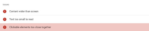
First thing this morning I rolled up my sleeves, found the email and clicked the Fix Mobile Usability Issues link to find out what all the fuss was about. Turns out it was complaining about just one page, an article on PowerShell scripting.
Reviewing the page using Firefox’s inbuilt responsive design mode – other browsers are available – my initial assessment still felt true: the font looked good and there were no overlapping clickable elements; but there was some white space to the right of the page that shouldn’t be there, scrolling down I found the reason. It turns out long links and words weren’t wrapping in the paragraphs.

Mobile devices will render pages with overflowing text or links like this differently. Some will display the page as expected, with normal sized text, allowing the page to be dragged to the right revealing the whole of the link if necessary; others will shrink the page until all the link content fits on screen, reducing the size of the text font, potentially making it unreadable.
Perhaps Google Search Console had a point, this issue could produce the effects described in the issues it reported:
- Text too small to read
- Clickable elements too close together
- Content Wider than screen
The solution, courtesy of CSS tricks, is to ensure links and long words break using CSS:
p {
    /* These are technically the same, but use both */
    overflow-wrap: break-word;
    word-wrap: break-word;
    -ms-word-break: break-all;
    /* This is the dangerous one in WebKit, as it breaks things wherever */
    word-break: break-all;
    /* Instead use this non-standard one: */
    word-break: break-word;
    /* Adds a hyphen where the word breaks, if supported (No Blink) */
    -ms-hyphens: auto;
    -moz-hyphens: auto;
    -webkit-hyphens: auto;
    hyphens: auto;
}
This allows the URLs to break whilst still being clickable, fixing the overflow issue and preventing mobile devices from shrinking the text.
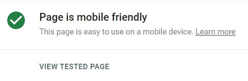
The website will now render correctly on those mobile devices affected. It may even perform better in search rankings now these issues, which may have been harming it's search rankings, have been resolved.
Want to Say Thanks?
Did this article help you? Want to say thanks? Then why not buy me a coffee?
 Copyright @ 2010-2024